Reproducible El Niños
of CSAG, republished courtesy of Authorea.
A lot of attention has been given to the consequences of the latest strong El Niño event. People often often talk about meteorological phenomena as El Niño (or La Niña) conditions, but what are these, and how do we come about our notions of what is a ’typical’ El Niño event? How consistent do we expect the effects of this phenomena to be, especially when these ’signature effects’ occur thousands of kilometers away from the Pacific Ocean? Often understanding about the typical effects of large scale climate variations are derived from composites. This is a common statistical method where elements are classified into groups based on some external consideration, and then the properties of each group is expressed by the average of all the elements it contains. This can be a very efficient way to visualize large data sets, but it can also imply more consistency within groups than is actually the case. This post goes over some of mechanics of creating composites, and ways to explore to what degree they can be taken at ’face value’.
Background
Big Picture
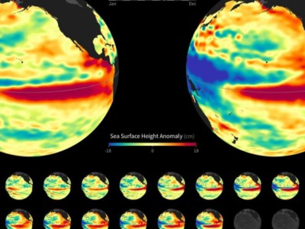
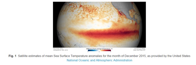
Just briefly, what is the El Niño Souther Oscillation (ENSO)? Typically, strong winds off the coast of Equatorial South America move surface water away from the coast, which is replaced from below with cold water from the ocean depths [this colder deep water also carries nutrients which are important for sustaining marine life]. If these winds weaken, upwelling decreases, and weather patterns [as well as fish stocks] are altered by the presence of this atypically warm surface water in the Central East Pacific [1]. This is known as an El Niño event and the oscillation between El Niño and the opposing La Niña states is termed ENSO.
There are many ways that people attempt to quantify the degree to which an El Niño state is occurring. These include average sea surface temperatures over various subregions of the Pacific Ocean, differences in air pressure between different locations, and more involved metrics that combine these and other factors. An overview of the more common approaches can be found here. An El Niño event does not manifest in the same way every time it occurs, but can have many different realizations or “flavors” (Hoell 2014). Which is why, as stressed in the linked discussion, there tend to be many approaches to quantifying ENSO, each of which highlights different aspects of the variation. Looking at documented values for some of the most common indices [2] shows similar general patterns, even though the different time series have noticeably different properties.
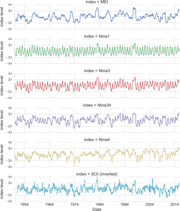
Fig. 2 Chronologies of various ENSO indices. [To see the details of, or to obtain and modify, the analysis presented here, view the ipython notebook source that was used to generate the original figure.]
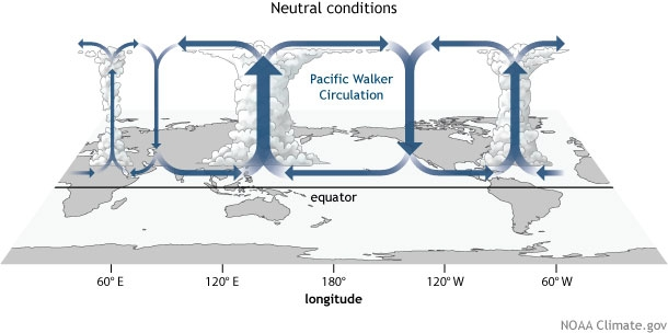
Fig. 3 Diagram of equatorial zonal circulation, as discussed here.
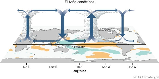
Fig. 4 Diagram of equatorial zonal circulation under El Niño conditions, as discussed here.
Yes, and...
So, a large scale redistribution of temperature causes shifts in the location of some major processes, and triggers complex response mechanisms that interact with local environments, to create conditions that would not commonly be observed in that area otherwise. And since the whole thing is tied up in the butterfly effect these conditions are neither perfectly reproducible, nor predictable, nor even fully comprehensible. Thanks Dr. Ian Malcolm, it’s much clearer now. But how do you pull a sense of what to expect from an El Niño out of all this? As said, there is an understanding of relevant mechanisms which, given certain conditions, generally function in discernible ways. But in practice much of the conception of a typical El Niño is based on historical observation (Dilley 2000). ”What was it like the last time? What is it typically like?”
Classification
The first step is to determine when was ”last time”? The historical indices [2] shown earlier can be used to determine this. For the example here we’re going to use the Multivariate ENSO Index (MEI) and consider El Niño events to be those where the index is above the 1σ1σ level. These are common choices, but it’s important to remember that it is still a subjective definition. The periods designated [5] will determine what data we consider for the rest of the example. Not only the estimates that we will create, but also the estimates of the uncertainty of those estimates, must all be given the caveat ”given our definition of an El Niño event”. This is not necessarily a bad thing. For many regions there are very sensible reasons to consider one ENSO indicator as more informative than another, or where there may not be much difference between them. But it’s something to keep in mind
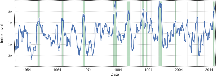
Fig. 5 Time line for ENSO strength as described by the MEI. Shaded bands are considered El Niño periods. [source]
What is happening within the selected periods, and is it different from what might be expected? Let’s consider the general region of Southern Africa [6].
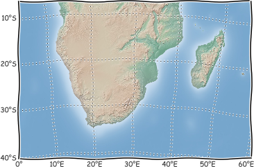
Fig. 6 Chart showing the Southern African region considered in this example. [source]
For this example lets look at mean monthly rainfall rates over the region. These values are a very ’broad strokes’ descriptor, and many people have pointed out that such measurements are not the best indicator of the more nuanced variations and chronologies that can directly affect agricultural yields (Tadross 2009) (Ambrosino 2013) or the risk of floods/droughts. It’s been argued that for Southern Africa, increased temperatures are more consistently observed during El Niño events than changes in precipitation patterns, and that droughts are more a result of the interactions between high temperatures and preexisting conditions, than low rainfall alone (Meque 2014). However, often the records needed for more involved studies are not available, and so large scale precipitation estimates are commonly what are reported and extrapolated from. As such, it’s important to have some sense of these products. Here we will consider the Global Precipitation Climatology Project GPCPdata set. As with the selected ENSO index, this is just one option of many. Working with multiple data sources is a complex problem, and will be addressed another time. There’s enough difficulty in reading the message of a single data source to keep us busy right now. Again though, it’s something to keep in mind; every part of the following analysis must be considered to be conditional on the choice of data set (the same as when choosing the El Niño definition).
So, lets look at a few sample months that were selected as occurring within El Niño periods. How are the estimated rainfall values different from what is typically observed on that given month [7]?
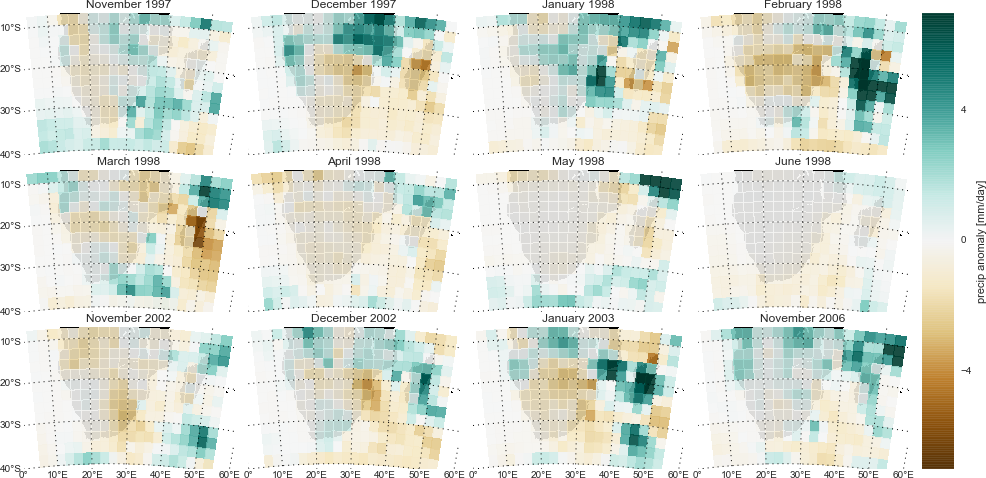
The scale of the anomalies also varies. This is expected as rainfall amounts themselves vary between regions and seasons. One of the reasons for selecting the GPCP product for this example is that this group provides error estimates for its monthly estimates. While they state that the procedure for deriving these values is simplistic (Huffman 2009), these estimates are still very useful for suggesting which anomalies are beyond the margin of error for the calculated value. What does the figure above [7] look like when we only consider anomalies that are strongly positive or negative enough to be beyond the estimated measurement error? This does filter out some noise in favor of the major events, although the images themselves are more complicated [8].
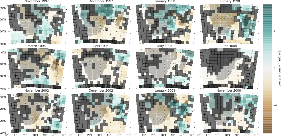
Fig. 8 Anomalies in mean monthly precipitation rate for selected months within El Niño periods, blanking out anomalies whose magnitude is low enough that they are within the estimated margin of error for the analysis. [source]
Composites
Okay, okay, so measurement and other estimation uncertainties mean that not every detail is significant, and there will always be variation between events. That’s fine, point taken, but what about the big picture? Overall, how do the circulation shifts mentioned earlier on [4] map onto the region?
Fig. 10 Same calculations as in Figure 9, but ignoring anomalies that were below the suggested error threshold. [source]
Ignoring questionable values does produce some interesting shifts in the images. Note that the scale is now [10] three times larger for than it was previously [9]. The mean estimate stays pretty similar, since the low magnitude noise that we are now ignoring would be mostly averaged out when creating the original composite [9]. There are bigger shifts in the median and mode as the low magnitude ’suspect’ values no longer define the mid-point or high frequency values, respectively. However, it becomes much more difficult to interpret these results since the number of samples used for each grid cell is now inconsistent. If all the samples for a particular area where below the error threshold, except for one… then that value becomes the mode of the data. Is that value then really indicative of a consistent El Niño effect? We see that if rather than ignoring questionable values we instead set them to zero [11], the results suggest a more restrictive version of the initial estimate [9].

Fig. 11 Same calculations as in Figure 9, but with anomalies that were below the suggested error threshold set to zero. [source]
Significance
So why is the number of samples used to do the calculation such a concern? It comes down to the idea of statistical significance; the question of how confident we can be that the associations we observe are not coincidental. If you have a sour stomach after a glass of milk, can you be sure the milk was off, or rather have you just discovered that you’re lactose intolerant? If you smoke five cigarettes with no notable ill effects, does that prove that they’re harmless to you?
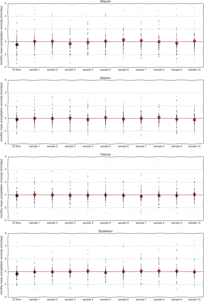
We saw [11] that certain regions see, on average, less rainfall during El Niño periods. But what if we had just pulled the values of a few random months from the full data set and averaged those? Even though the mean anomaly of the full data set is, by definition, zero, the odds are reasonable that you could by chance select only high or low values. Although, the odds of this decrease as the size of the samples increase. To illustrate we’ll consider just four grid cells, which contain large cities in south-east Africa.
